Sunday, August 27, 2006

Fifth Painting

Yep a space art piece (click on it to view larger version).


Starfield and planet made following the tutorials by Greg Martin (links in previous post). hmmmm many of the stars seem square...so not the best starfield, but hey it's just practice. The couple is doodled in very quickly, so if they look human...cool. The grass is made with the standard photoshop grass brush.

Saturday, August 26, 2006

Space Art

Gary Tonge makes the coolest space art around. Check it out here.

Space related art is also called Celestial art, but that is more tuned towards heavenly/dreamy characters that often have space art as a background. Here is a website with celestial art.

In my last piece of art I made a planet by following this tutorial by Greg Martin. Here is another tutorial by him about how to make a nice starfield. He also has created this article for 3DTotal discussing how to make space art. Check out his gallery here.

And lastly here is a tutorials how to make nebulaes.

Sunday, August 20, 2006

Fourth Painting

Yep, a painting on a photograph.


Here is the original Image. Took this photo a week ago. This dude controls a light canon for a live tv show.

I continue my starry night style. Guess I have to learn how to make a nice starfield next then, right now I'm just clicking with a soft brush.

Saturday, August 19, 2006

Painting on photographs

Mattepainters usually paint on photos to make reality a bit more spectacular. Here is a good example of that: LOTR Matte. Roll the mouse over to see the original photograph. This was painted by Dylan Cole for the LOTR.

My favorite photographer painted on his photos. His name is Jan Saudek. Here's some pics from him:
Zuzanka's Night Window
Hey, Joe!
120 km/h

He also did just photographs, and pure paintings, but the ones I like the most is when he mixed the two arts.

I guess that's where I am heading, since I am a photographer learning painting, and it makes sense for me, mixing these two. Making reality a bit more exciting, isn't that what we all seek?

Sunday, August 13, 2006

Third Painting

ok, it's a weird one, but hey it's a speed painting :-)


Maybe it's a bit dark, but click on it to see a larger version. I used a couple of hours on it. Don't know the time limit for when it's speed painting or not. Actually I like the term sketch better, but maybe joining the hype is good for search engine traffic.

Saturday, August 12, 2006

Speed Painting

I guess speed painting is a fancy word for sketching. They are both done quick and have few details, but enough to see what it is. I think this is a good way to learn painting, because one doesn't need to fickle with details forever, just getting down ideas and strengthening basic skills fast.

Check out Craig Mullins sketch gallery. Some are very rough, but still he creates an illusion of more detail. This is an amazing gallery! Here is a tutorial explaining the basic steps of his sketching process.

The good thing with these are that you can make many paintings a day, and increase your skills very fast. I have seen many styles of speedpainting, some hinting forms with finer strokes, other blocking in big shapes, and refining from there. I will just try out different stuff to see what works for me.

Sunday, August 06, 2006

Second Painting

Trying to make one each weekend. This time I'm trying a cartoon figure, Spiderman.


Made the lineart first, then basic colors with flats, and then highlights and shadows with a low opacity brush. City is made with one of I-NetGraFX brushes, and the moon is simply a circle with a blurred duplicate in the background.

Saturday, August 05, 2006

Composition

Since my other hobby is photography, I already know some things about this topic.

- Landscape pictures should have a foreground, a midground and a background.

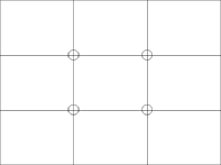
- The rule of thirds say that the main focal point should not placed in the middle as many do, but at the instersection of the lines shown in the pic here. The rule of thirds also suggest the horizon line to be along one of the lines and not be in the middle of the image.
- Avoid competing focal points.

- Balance the picture, in other words not to have more stuff on one side than the other.

- Objects in motion needs much space in front of the moving direction.

- It's good to direct the wandering of the eyes around the picture, make the viewer spend some time in it, and that the first path should lead to the main object of interest. And that s-shaped paths are better than straight.

- Objects should not share edges.

These are some rules I follow when taking photos, all these applies to paintings too, but since there are more control when painting other rules apply too.

- Break up big surfaces (with shadow, reflection, light, textures, imperfections etc.)

- Get the perspective right (usually two point perspective).

- Use values for depth. Objects closer should be darker and contrastier and further away should be lighter and more washed out.

- Choose a main hue for the painting, but add other hues for variation (analogous, complements or triads).

- Vary the shapes. A painting with many square shapes (f.ex. buildings) should be balanced with rounder shapes (f.ex. clouds).

Here are more rules:
Landscape Composition Rules
The Basics of Landscape Composition
Composition: Understanding it - Using it!
Rule of Thirds